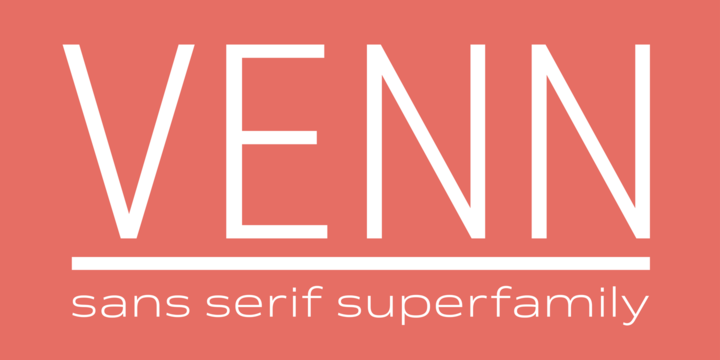
Venn has been designed to respond to the typographic needs of the most demanding brands and users, with 25 styles from Light Condensed to ExtraBold Extended. This range allows designers to choose the right style in print, web, or app.

Venn has been designed to respond to the typographic needs of the most demanding brands and users, with 25 styles from Light Condensed to ExtraBold Extended. This range allows designers to choose the right style in print, web, or app.

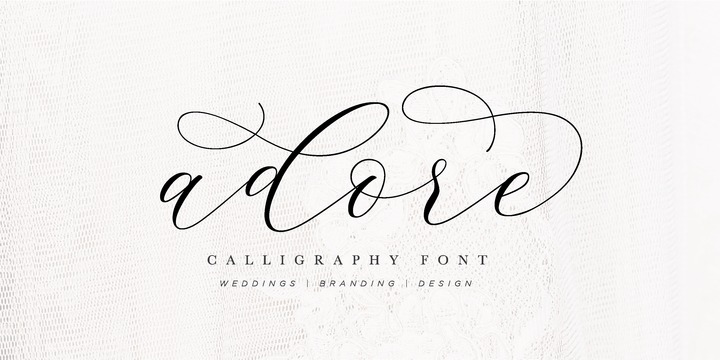
Introducing the elegant Adore Calligraphy Font! Adore Calligraphy was built with OpenType features and includes beginning and end swashes as well as alternate swash characters for all lowercase letters. Each character was thoughtfully crafted to create a timeless elegant look. For those of you who are needing a touch of elegance and modernity for your designs, this font is for you!

JH Lina is an Arabic Naskh typeface, including four weights; it is typical for long running text, headlines, branding , news letters, magazines, signage and electronic publishings ...
The diacritic positioning is fine tuned per the publishers requirements.

Ekster is a geometric sans serif typeface from the Parisian designer Ilya Naumoff. Many of its letters are simplified; you’ll find several places in the typeface where the connection of bowls to stems isn’t fussy, for example, and horizontal strokes – like those in the ‘f’ and the ’t’ along the x-height – don’t bisect their letters’ main vertical stems (but populate the left-hand side only instead). Ekster’s lowercase ‘u’ is also symmetrical. The family includes a staggering number of weights – eight in total, and these range from Thin through Black. Each weight has both an upright font and an oblique-style italic on offer. The letterforms in all of the Ekster weights are drawn with virtually monolinear strokes. Ekster’s x-height is moderate, and the lowercase’s ascenders rise up to the same height as the capital letters and the numerals. However, the best feature of Ekster’s fonts is the large number of alternates that they contain. Ekster includes alternate forms for almost every lowercase letter, and some even have more than one alternate available – like the ‘a’, ‘e’, and ‘r’. Ekster is an excellent choice for use in both corporate design and editorial design projects, both because of its range of font weights and styles as well as because of its legibility in text.

An elegant, stylish and easy-to-use typeface.
Just as a nice hat makes you look good, Cagliari brings beauty to your designs—through the traditional flavor of Didone faces, and the simplicity of Modern and neo-Grotesk fonts.
The font is based on the “Queulat” design yet features a higher contrast, between thick and thin strokes, which makes it look simple and suitable for a wider range of uses. Due to an abrupt contrast in stroke weight, Cagliari is more noticeable on terminals and teardrop terminals compared to Queulat. The Neogrotesk-style shapes add a minimalist touch to the font with thoughtful attention to detail.
Cagliari is the ideal choice for fashion magazines, Italian-author books and logotypes for prestigious brands.

Rough monospace type with cowboy boots: Here is Justice! Initially designed in 2004, Justice has been totally rethought in 2017 for the visual identity of Ceinturama. For this new version the fixed-width principle has been used to turn this typeface into a kind of construction game. A series of decorative accessories (systems of borders, arrows and ornaments) have been developed in order to make typesetting more playful.
Designed from the outset to be as comfortable on screen, on paper as on wall, Justice has aesthetic qualities suitable for handmade signage. It’s your turn to play!
Please find the PDF type specimen/manual over there.

Gordita is a minimal sans serif typeface with a geometric foundation that has been built upon with modern details that result in an optically balanced, friendly typeface.
When designing Gordita referring to features in Futura were influential as were the structural and harmonious strokes of Gotham. Forms have been optically compensated to appear natural and purely geometric. Joints are slightly tapered and ink traps feature in heavier weights with the purpose of achieving maximum legibility.
Gordita has been tested in print and on screen in a wide range of point/pixel sizes. The family is equipped with OpenType features including alternate glyphs, fractions, case sensitive forms, small figures, arrows and symbols as well as old style and tabular figures.
Now delivered in 7 weights with matching italics that slant at 15°. The italics are slightly lighter and narrower than the upright versions. The horizontal weighting in the italics have been reduced to compensate for the loss of vertical stroke thickness.
With support for over two hundred languages with an extended Latin and Cyrillic character set, Gordita is ready to be put to work. Designed by Thomas Gillett, metrics and engineering by iKern (Igino Marini).
The family has been recently updated to include two additional weights (Thin & Ultra + their matching italics) as well as slightly opened apertures for better legibility in the heavier weights, new glyphs and more opentype features.

Nuber Next is a modern geometric sans influenced by the popular neo-grotesques of the 1950s including Helvetica and Univers. Carefully remastered from the original Nuber type family to improve letter shape, overall uniformity and introduce a flexible width system capable of handling a wider variety of modern typographic methods. Details include 573 characters, nine weights, five widths with matching italics, alternative uppercase R, alternative lowercase a, e, g, i and y. Opentype features include five variations of numerals, numerators, denominators, fractions and language support covering Western, South and Central Europe.

Liliana is a geometrical typeface, born throughout comprehensive formal studies while testing new ways of displaying certain words and sentences. The essential structure of Liliana is very conservative: It can look similar to other geometrical typographies, however, it has unique features that make this project very special.
Liliana is a typeface that will work perfectly while setting short texts, words, and phrases as well. It shall perform greatly even when the paragraph is too short. Thanks to the versatility of its alternate characters, Liliana is perfect to achieve eye-catching texts.
The spirit of this typography is focused on its “s” character, which originates from manuscript writings and provides a very special identity. If the text does not contain the letter “s”, the intended personality can still be achieved by using alternate characters such as “f”, “l”, “r” and “L”, which are aligned with the same concept. On top of that, may all this still not be enough, you can furthermore use its ligatures and swashes. It is actually hard not to set a spectacular text with Liliana!
Liliana is a typeface optimal for being used in marketing assets, packaging design, magazines, branding, film captions, headlines, editorial, quotes, logos, corporate identity, and motion graphics.
The italic version has a 10-degree slant. This feature is intended to convey a gorgeous feeling of tension, power, and agility. It’s very interesting to realize how the dynamism in the italic characters works when compared with the regular ones.
The typeface has 9 weights, ranging from “thin” to “heavy”, and two versions: “regular” and “italic”. Its 18 files contain 642 characters with ligatures, alternates, and swashes. It supports 219 Latin-based languages, spanning through 212 different countries.
Liliana supports this languages: Abenaki, Afaan Oromo, Afar, Afrikaans, Albanian, Alsatian, Amis, Anuta, Aragonese, Aranese, Aromanian, Arrernte, Arvanitic (Latin), Asturian, Atayal, Aymara, Bashkir (Latin), Basque, Bemba, Bikol, Bislama, Bosnian, Breton, Cape Verdean Creole, Catalan, Cebuano, Chamorro, Chavacano, Chichewa, Chickasaw, Cimbrian, Cofán, Corsican Creek,Crimean Tatar (Latin),Croatian, Czech, Dawan, Delaware, Dholuo, Drehu, Dutch, English, Estonian, Faroese, Fijian Filipino, Finnish, Folkspraak, French, Frisian, Friulian, Gagauz (Latin), Galician, Ganda, Genoese, German, Gikuyu, Gooniyandi, Greenlandic (Kalaallisut)Guadeloupean, Creole, Gwich’in, Haitian, Creole, Hän, Hawaiian, Hiligaynon, Hopi, Hotcąk (Latin), Hungarian, Icelandic, Ido, IgboI, locano, Indonesian, Interglossa, Interlingua, Irish, Istro-Romanian, Italian, Jamaican, Javanese (Latin), Jèrriais, Kala Lagaw Ya, Kapampangan (Latin), Kaqchikel, Karakalpak (Latin), Karelian (Latin), Kashubian, Kikongo, Kinyarwanda, Kiribati, Kirundi, Klingon, Ladin, Latin, Latino sine Flexione, Latvian, Lithuanian, Lojban, Lombard, Low Saxon, Luxembourgish, Maasai, Makhuwa, Malay, Maltese, Manx, Māori, Marquesan, Megleno-Romanian, Meriam Mir, Mirandese, Mohawk, Moldovan, Montagnais, Montenegrin, Murrinh-Patha, Nagamese Creole, Ndebele, Neapolitan, Ngiyambaa, Niuean, Noongar, Norwegian, Novial, Occidental, Occitan, Old Icelandic, Old Norse, Oshiwambo, Ossetian (Latin), Palauan, Papiamento, Piedmontese, Polish, Portuguese, Potawatomi, Q’eqchi’, Quechua, Rarotongan, Romanian, Romansh, Rotokas, Sami (Inari Sami), Sami (Lule Sami), Sami (Northern Sami), Sami (Southern Sami), Samoan, Sango, Saramaccan, Sardinian, Scottish Gaelic, Serbian (Latin), Seri, Seychellois Creole, Shawnee, Shona, Sicilian, Silesian, Slovak, Slovenian, Slovio (Latin), Somali, Sorbian (Lower Sorbian), Sorbian (Upper Sorbian), Sotho (Northern), Sotho (Southern), Spanish, Sranan, Sundanese (Latin), Swahili, Swazi, Swedish, Tagalog, Tahitian, Tetum, Tok Pisin, Tokelauan, Tongan, Tshiluba, Tsonga, Tswana, Tumbuka, Turkish, Turkmen (Latin), Tuvaluan, Tzotzil, Uzbek (Latin), Venetian, Vepsian, Volapük, Võro, Wallisian, Walloon, Waray-Waray, Warlpiri, Wayuu, Welsh, Wik-Mungkan, Wiradjuri, Wolof, Xavante, Xhosa, Yapese, Yindjibarndi, Zapotec, Zulu, Zuni.

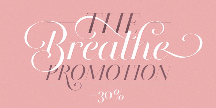
Breathe Neue is not just an update of my renowned Breathe of 2010, this is something else...
Many times I find myself looking for inspiration in my previous creations. The original Breathe has something on its essence: Something that almost 10 years later still caught my attention. Like its name suggests, letters seem to be breathing, moving, alive. Many years passed so I asked myself if there was still something I could do for it, something to get the most of that beautiful essence... Suddenly, I was already working on its curves: Many new loops, more polished, more refined. Also the proportion and spacing were altered to embellish the font.
Breathe Neue’s swashes are addictive. I couldn't find another word. Irresistible? Maybe. Once you see some of its loops you want to see more. I believe this might be due to its very geometrical feel, which match well with the bodonian curves of the font.
See also how well it works with Breathe Caps. And what if you combine them with Breathe Special? wow.
I'm still young (yeah, sure) and I believe there're still many years ahead to enjoy this great profession, and to make many new (and astonishing, I hope) fonts. But I also think, it’s time to pamper my first creations. They deserve the best treatment, after all, they were once a success!
This is what I did with my lovely Breathe. I hope you like it.

Fountaine script is a new and fresh font script that comes with two styles of clean and rough style. so this font can provide an alternative, new sensation and vintage feel for the designer or craftsman, in working on various projects.
This font is perfect for all your project like the wedding invitation, greeting cards, branding materials, business cards, quotes, posters, insignia, badge, greeting cards, vintage logo, or you can use this font for various logo project (logotype) and more!
Fountaine script come with 325 glyphs totally. The alternative characters were divided into several Open Type features such as Swash, Stylistic Sets, Stylistic Alternates, Contextual Alternates, and Ligature. The Open Type features can be accessed by using Open Type savvy programs such as Adobe Illustrator, Adobe InDesign, Adobe Photoshop Corel Draw X version, And Microsoft Word. And this Font has given PUA Unicode (specially coded fonts). so that all the alternate characters can easily be fully accessed by a craftsman or designer through either Windows or Mac computer without any requirement for fancy design software.
Mail support: If you have any question, please contact me Via e-mail "[email protected]"
Thank You!

Worthington Arcade is a classically-proportioned capitals-only type incorporating a selection of ligatures and alternates.
It loosely resembles the hand-painted architectural lettering of the 30s to the 50s, exemplified by the likes of Percy Smith’s interior signage for the BBC or George Mansell’s lettering for the University of London and the signs found on London’s bridges. However, rather than a slavish copy of any historical model, it is more an examination and evocation of certain idiosyncratic quirks of civic lettering of the period, and an attempt to create a peculiarly English titling typeface.
The round letters, for example the O, Q and C, are wider than the perfect circle usually found in such designs, while the straight-sided characters, usually drawn on a square, are narrower. This lends the whole a subtle elegance that is also emphasized by the raised crossbars on the H, E and F and extended lower leg of the E.
Includes old-style numerals.

strokeWeight is inspired by the aesthetics of computer vector graphics. strokeWeight is the name of a processing programming function to set the thickness of a stroke. The single bezier curve that describes a stem as a centerline with a particular stem thickness represents the basic idea of this typeface. The unconventional corners and stem endings derive from the concept.
If you buy the complete strokeWeight family you will get a strokeWeight variable font file for free!
©
Isabel Willason
2014 . Powered by
Blogger
Blogger Templates
.
.